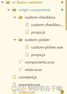
README.md
- uview官网:https://www.uviewui.com/components/picker.html
- 在uview的组件的基础上改造
- 使用了uview的picker组件和checkbox组件

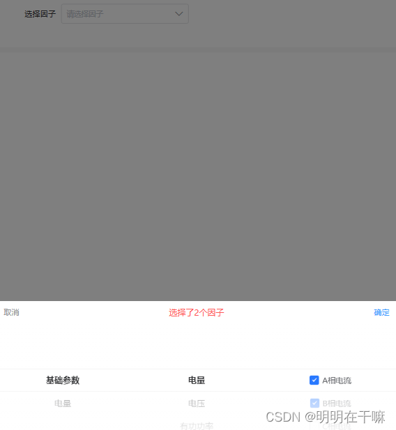
效果如图
复制一份uview的picker组件和checkbox组件的代码
- origin-component/custom-checkbox/custom-checkbox.vue
- 注释掉了uni.$u.error('u-checkbox必须搭配u-checkbox-group组件使用'),避免为写在u-checkbox-group组件下控制台报错
<template>
	<view
	    class="u-checkbox"
	    :style="[checkboxStyle]"
	    @tap.stop="wrapperClickHandler"
	    :class="[`u-checkbox-label--${parentData.iconPlacement}`, parentData.borderBottom && parentData.placement === 'column' && 'u-border-bottom']"
	>
		<view
		    class="u-checkbox__icon-wrap"
		    @tap.stop="iconClickHandler"
		    :class="iconClasses"
		    :style="[iconWrapStyle]"
		>
			<slot name="icon">
				<u-icon
				    class="u-checkbox__icon-wrap__icon"
				    name="checkbox-mark"
				    :size="elIconSize"
				    :color="elIconColor"
				/>
			</slot>
		</view>
		<text
		    @tap.stop="labelClickHandler"
		    :style="{
				color: elDisabled ? elInactiveColor : elLabelColor,
				fontSize: elLabelSize,
				lineHeight: elLabelSize
			}"
		>{{label}}</text>
	</view>
</template>

<script>
	import props from './props.js';
	/**
	 * checkbox  复选框
	 * @description 复选框组件一般用于需要多个选择的场景,该组件功能完整,使用方便
	 * @tutorial https://uviewui.com/components/checkbox.html
	 * @property {String | Number | Boolean}	name			checkbox组件的标示符
	 * @property {String}						shape			形状,square为方形,circle为圆型
	 * @property {String | Number}				size			整体的大小
	 * @property {Boolean}						checked			是否默认选中
	 * @property {String | Boolean}				disabled		是否禁用
	 * @property {String}						activeColor		选中状态下的颜色,如设置此值,将会覆盖parent的activeColor值
	 * @property {String}						inactiveColor	未选中的颜色
	 * @property {String | Number}				iconSize		图标的大小,单位px
	 * @property {String}						iconColor		图标颜色
	 * @property {String | Number}				label			label提示文字,因为nvue下,直接slot进来的文字,由于特殊的结构,无法修改样式
	 * @property {String}						labelColor 		label的颜色
	 * @property {String | Number}				labelSize		label的字体大小,px单位
	 * @property {String | Boolean}				labelDisabled	是否禁止点击提示语选中复选框
	 * @property {Object}						customStyle		定义需要用到的外部样式
	 *
	 * @event {Function}	change	任一个checkbox状态发生变化时触发,回调为一个对象
	 * @example <u-checkbox v-model="checked" :disabled="false">天涯</u-checkbox>
	 */
	export default {
		name: "custom-checkbox",
		mixins: [uni.$u.mpMixin, uni.$u.mixin,props],
		data() {
			return {
				isChecked: false,
				// 父组件的默认值,因为头条小程序不支持在computed中使用this.parent.shape的形式
				// 故只能使用如此方法
				parentData: {
					iconSize: 12,
					labelDisabled: null,
					disabled: null,
					shape: 'square',
					activeColor: null,
					inactiveColor: null,
					size: 18,
					value: null,
					iconColor: null,
					placement: 'row',
					borderBottom: false,
					iconPlacement: 'left'
				}
			}
		},
		computed: {
			// 是否禁用,如果父组件u-raios-group禁用的话,将会忽略子组件的配置
			elDisabled() {
				return this.disabled !== '' ? this.disabled : this.parentData.disabled !== null ? this.parentData.disabled : false;
			},
			// 是否禁用label点击
			elLabelDisabled() {
				return this.labelDisabled !== '' ? this.labelDisabled : this.parentData.labelDisabled !== null ? this.parentData.labelDisabled :
					false;
			},
			// 组件尺寸,对应size的值,默认值为21px
			elSize() {
				return this.size ? this.size : (this.parentData.size ? this.parentData.size : 21);
			},
			// 组件的勾选图标的尺寸,默认12px
			elIconSize() {
				return this.iconSize ? this.iconSize : (this.parentData.iconSize ? this.parentData.iconSize : 12);
			},
			// 组件选中激活时的颜色
			elActiveColor() {
				return this.activeColor ? this.activeColor : (this.parentData.activeColor ? this.parentData.activeColor : '#2979ff');
			},
			// 组件选未中激活时的颜色
			elInactiveColor() {
				return this.inactiveColor ? this.inactiveColor : (this.parentData.inactiveColor ? this.parentData.inactiveColor :
					'#c8c9cc');
			},
			// label的颜色
			elLabelColor() {
				return this.labelColor ? this.labelColor : (this.parentData.labelColor ? this.parentData.labelColor : '#606266')
			},
			// 组件的形状
			elShape() {
				return this.shape ? this.shape : (this.parentData.shape ? this.parentData.shape : 'circle');
			},
			// label大小
			elLabelSize() {
				return uni.$u.addUnit(this.labelSize ? this.labelSize : (this.parentData.labelSize ? this.parentData.labelSize :
					'15'))
			},
			elIconColor() {
				const iconColor = this.iconColor ? this.iconColor : (this.parentData.iconColor ? this.parentData.iconColor :
					'#ffffff');
				// 图标的颜色
				if (this.elDisabled) {
					// disabled状态下,已勾选的checkbox图标改为elInactiveColor
					return this.isChecked ? this.elInactiveColor : 'transparent'
				} else {
					return this.isChecked ? iconColor : 'transparent'
				}
			},
			iconClasses() {
				let classes = []
				// 组件的形状
				classes.push('u-checkbox__icon-wrap--' + this.elShape)
				if (this.elDisabled) {
					classes.push('u-checkbox__icon-wrap--disabled')
				}
				if (this.isChecked && this.elDisabled) {
					classes.push('u-checkbox__icon-wrap--disabled--checked')
				}
				// 支付宝,头条小程序无法动态绑定一个数组类名,否则解析出来的结果会带有",",而导致失效
				// #ifdef MP-ALIPAY || MP-TOUTIAO
				classes = classes.join(' ')
				// #endif
				return classes
			},
			iconWrapStyle() {
				// checkbox的整体样式
				const style = {}
				style.backgroundColor = this.isChecked && !this.elDisabled ? this.elActiveColor : '#ffffff'
				style.borderColor = this.isChecked && !this.elDisabled ? this.elActiveColor : this.elInactiveColor
				style.width = uni.$u.addUnit(this.elSize)
				style.height = uni.$u.addUnit(this.elSize)
				// 如果是图标在右边的话,移除它的右边距
				if (this.parentData.iconPlacement === 'right') {
					style.marginRight = 0
				}
				return style
			},
			checkboxStyle() {
				const style = {}
				if (this.parentData.borderBottom && this.parentData.placement === 'row') {
					uni.$u.error('检测到您将borderBottom设置为true,需要同时将u-checkbox-group的placement设置为column才有效')
				}
				// 当父组件设置了显示下边框并且排列形式为纵向时,给内容和边框之间加上一定间隔
				if (this.parentData.borderBottom && this.parentData.placement === 'column') {
					style.paddingBottom = '8px'
				}
				return uni.$u.deepMerge(style, uni.$u.addStyle(this.customStyle))
			}
		},
		mounted() {
			this.init()
		},
		methods: {
			init() {
				// 支付宝小程序不支持provide/inject,所以使用这个方法获取整个父组件,在created定义,避免循环引用
				this.updateParentData()
				if (!this.parent) {
					// uni.$u.error('u-checkbox必须搭配u-checkbox-group组件使用')
				}
				// 设置初始化时,是否默认选中的状态,父组件u-checkbox-group的value可能是array,所以额外判断
				if (this.checked) {
					this.isChecked = true
				} else if (uni.$u.test.array(this.parentData.value)) {
					// 查找数组是是否存在this.name元素值
					this.isChecked = this.parentData.value.some(item => {
						return item === this.name
					})
				}
			},
			updateParentData() {
				this.getParentData('u-checkbox-group')
			},
			// 横向两端排列时,点击组件即可触发选中事件
			wrapperClickHandler(e) {
				this.parentData.iconPlacement === 'right' && this.iconClickHandler(e)
			},
			// 点击图标
			iconClickHandler(e) {
				this.preventEvent(e)
				// 如果整体被禁用,不允许被点击
				if (!this.elDisabled) {
					this.setRadioCheckedStatus()
				}
			},
			// 点击label
			labelClickHandler(e) {
				this.preventEvent(e)
				// 如果按钮整体被禁用或者label被禁用,则不允许点击文字修改状态
				if (!this.elLabelDisabled && !this.elDisabled) {
					this.setRadioCheckedStatus()
				}
			},
			emitEvent() {
				this.$emit('change', this.isChecked)
				// 尝试调用u-form的验证方法,进行一定延迟,否则微信小程序更新可能会不及时
				this.$nextTick(() => {
					uni.$u.formValidate(this, 'change')
				})
			},
			// 改变组件选中状态
			// 这里的改变的依据是,更改本组件的checked值为true,同时通过父组件遍历所有u-checkbox实例
			// 将本组件外的其他u-checkbox的checked都设置为false(都被取消选中状态),因而只剩下一个为选中状态
			setRadioCheckedStatus() {
				// 将本组件标记为与原来相反的状态
				this.isChecked = !this.isChecked
				this.emitEvent()
				typeof this.parent.unCheckedOther === 'function' && this.parent.unCheckedOther(this)
			}
		},
		watch:{
			checked(){
				this.isChecked = this.checked
			}
		}
	}
</script>

<style lang="scss" scoped>
	@import "../components.scss";
	$u-checkbox-icon-wrap-margin-right:6px !default;
	$u-checkbox-icon-wrap-font-size:6px !default;
	$u-checkbox-icon-wrap-border-width:1px !default;
	$u-checkbox-icon-wrap-border-color:#c8c9cc !default;
	$u-checkbox-icon-wrap-icon-line-height:0 !default;
	$u-checkbox-icon-wrap-circle-border-radius:100% !default;
	$u-checkbox-icon-wrap-square-border-radius:3px !default;
	$u-checkbox-icon-wrap-checked-color:#fff !default;
	$u-checkbox-icon-wrap-checked-background-color:red !default;
	$u-checkbox-icon-wrap-checked-border-color:#2979ff !default;
	$u-checkbox-icon-wrap-disabled-background-color:#ebedf0 !default;
	$u-checkbox-icon-wrap-disabled-checked-color:#c8c9cc !default;
	$u-checkbox-label-margin-left:5px !default;
	$u-checkbox-label-margin-right:12px !default;
	$u-checkbox-label-color:$u-content-color !default;
	$u-checkbox-label-font-size:15px !default;
	$u-checkbox-label-disabled-color:#c8c9cc !default;

	.u-checkbox {
		/* #ifndef APP-NVUE */
		@include flex(row);
		/* #endif */
		overflow: hidden;
		flex-direction: row;
		align-items: center;

		&-label--left {
			flex-direction: row
		}

		&-label--right {
			flex-direction: row-reverse;
			justify-content: space-between
		}

		&__icon-wrap {
			/* #ifndef APP-NVUE */
			box-sizing: border-box;
			// nvue下,border-color过渡有问题
			transition-property: border-color, background-color, color;
			transition-duration: 0.2s;
			/* #endif */
			color: $u-content-color;
			@include flex;
			align-items: center;
			justify-content: center;
			color: transparent;
			text-align: center;
			margin-right: $u-checkbox-icon-wrap-margin-right;

			font-size: $u-checkbox-icon-wrap-font-size;
			border-width: $u-checkbox-icon-wrap-border-width;
			border-color: $u-checkbox-icon-wrap-border-color;
			border-style: solid;

			/* #ifdef MP-TOUTIAO */
			// 头条小程序兼容性问题,需要设置行高为0,否则图标偏下
			&__icon {
				line-height: $u-checkbox-icon-wrap-icon-line-height;
			}

			/* #endif */

			&--circle {
				border-radius: $u-checkbox-icon-wrap-circle-border-radius;
			}

			&--square {
				border-radius: $u-checkbox-icon-wrap-square-border-radius;
			}

			&--checked {
				color: $u-checkbox-icon-wrap-checked-color;
				background-color: $u-checkbox-icon-wrap-checked-background-color;
				border-color: $u-checkbox-icon-wrap-checked-border-color;
			}

			&--disabled {
				background-color: $u-checkbox-icon-wrap-disabled-background-color !important;
			}

			&--disabled--checked {
				color: $u-checkbox-icon-wrap-disabled-checked-color !important;
			}
		}

		&__label {
			/* #ifndef APP-NVUE */
			word-wrap: break-word;
			/* #endif */
			margin-left: $u-checkbox-label-margin-left;
			margin-right: $u-checkbox-label-margin-right;
			color: $u-checkbox-label-color;
			font-size: $u-checkbox-label-font-size;

			&--disabled {
				color: $u-checkbox-label-disabled-color;
			}
		}
	}
</style>
- origin-component/custom-checkbox/props.js
- 完全复制uview-ui的代码
export default {
    props: {
        // checkbox的名称
        name: {
            type: [String, Number, Boolean],
            default: uni.$u.props.checkbox.name
        },
        // 形状,square为方形,circle为圆型
        shape: {
            type: String,
            default: uni.$u.props.checkbox.shape
        },
        // 整体的大小
        size: {
            type: [String, Number],
            default: uni.$u.props.checkbox.size
        },
        // 是否默认选中
        checked: {
            type: Boolean,
            default: uni.$u.props.checkbox.checked
        },
        // 是否禁用
        disabled: {
            type: [String, Boolean],
            default: uni.$u.props.checkbox.disabled
        },
        // 选中状态下的颜色,如设置此值,将会覆盖parent的activeColor值
        activeColor: {
            type: String,
            default: uni.$u.props.checkbox.activeColor
        },
        // 未选中的颜色
        inactiveColor: {
            type: String,
            default: uni.$u.props.checkbox.inactiveColor
        },
        // 图标的大小,单位px
        iconSize: {
            type: [String, Number],
            default: uni.$u.props.checkbox.iconSize
        },
        // 图标颜色
        iconColor: {
            type: String,
            default: uni.$u.props.checkbox.iconColor
        },
        // label提示文字,因为nvue下,直接slot进来的文字,由于特殊的结构,无法修改样式
        label: {
            type: [String, Number],
            default: uni.$u.props.checkbox.label
        },
        // label的字体大小,px单位
        labelSize: {
            type: [String, Number],
            default: uni.$u.props.checkbox.labelSize
        },
        // label的颜色
        labelColor: {
            type: String,
            default: uni.$u.props.checkbox.labelColor
        },
        // 是否禁止点击提示语选中复选框
        labelDisabled: {
            type: [String, Boolean],
            default: uni.$u.props.checkbox.labelDisabled
        }
    }
}
- origin-component/custom-picker/custom-picker.vue
-
改造了picker-view-column标签下的代码,之前只是文字形式,现在让叶子节点也就是最后一集级以复选框的形式展示,leafLevel是外面传进来的叶子节点的层级
-
增加方法boxItemChange 监听checkbox的选择状态,并调用父组件的boxChange方法


<template>
	<u-popup :show="show" @close="closeHandler">
		<view class="u-picker">
			<u-toolbar v-if="showToolbar" :cancelColor="cancelColor" :confirmColor="confirmColor"
				:cancelText="cancelText" :confirmText="confirmText" :title="title" :titleColor="titleColor"
				@cancel="cancel" @confirm="confirm"></u-toolbar>
			<picker-view class="u-picker__view" :indicatorStyle="`height: ${$u.addUnit(itemHeight)}`"
				:value="innerIndex" :immediateChange="immediateChange" :style="{
					height: `${$u.addUnit(visibleItemCount * itemHeight)}`
				}" @change="changeHandler">
				<picker-view-column v-for="(item, index) in innerColumns" :key="index" class="u-picker__view__column">
					<block v-if="index != leafLevel">
						<text v-if="$u.test.array(item)" class="u-picker__view__column__item u-line-1"
							:class="item1.class" v-for="(item1, index1) in item" :key="index1" :style="{
							height: $u.addUnit(itemHeight),
							lineHeight: $u.addUnit(itemHeight),
							fontWeight: index1 === innerIndex[index] ? 'bold' : 'normal'
						}">{{ getItemText(item1) }}</text>
					</block>
					<block v-else>
						<custom-checkbox class="u-line-1 checkbox-container" :customStyle="{display:'flex !important'}"
							v-for="(item1, index1) in item" :key="item1.label" :label="item1.label" :name="item1.label" :checked="isBoxChecked(item1)"
							@change="boxItemChange(item1,$event)">
						</custom-checkbox>
					</block>
				</picker-view-column>
			</picker-view>
			<view v-if="loading" class="u-picker--loading">
				<u-loading-icon mode="circle"></u-loading-icon>
			</view>
		</view>
	</u-popup>
</template>

<script>
	/**
	 * u-picker
	 * @description 选择器
	 * @property {Boolean}			show				是否显示picker弹窗(默认 false )
	 * @property {Boolean}			showToolbar			是否显示顶部的操作栏(默认 true )
	 * @property {String}			title				顶部标题
	 * @property {Array}			columns				对象数组,设置每一列的数据
	 * @property {Boolean}			loading				是否显示加载中状态(默认 false )
	 * @property {String | Number}	itemHeight			各列中,单个选项的高度(默认 44 )
	 * @property {String}			cancelText			取消按钮的文字(默认 '取消' )
	 * @property {String}			confirmText			确认按钮的文字(默认 '确定' )
	 * @property {String}			cancelColor			取消按钮的颜色(默认 '#909193' )
	 * @property {String}			confirmColor		确认按钮的颜色(默认 '#3c9cff' )
	 * @property {String | Number}	visibleItemCount	每列中可见选项的数量(默认 5 )
	 * @property {String}			keyName				选项对象中,需要展示的属性键名(默认 'text' )
	 * @property {Boolean}			closeOnClickOverlay	是否允许点击遮罩关闭选择器(默认 false )
	 * @property {Array}			defaultIndex		各列的默认索引
	 * @property {Boolean}			immediateChange		是否在手指松开时立即触发change事件(默认 false )
	 * @property {Number}			leafLevel 叶子节点的层级
	 * @event {Function} close		关闭选择器时触发
	 * @event {Function} cancel		点击取消按钮触发
	 * @event {Function} change		当选择值变化时触发
	 * @event {Function} boxChange		当最后一级多选框值变化时触发
	 * @event {Function} confirm	点击确定按钮,返回当前选择的值
	 */
	import props from './props.js';
	import CustomCheckbox from '../custom-checkbox/custom-checkbox.vue'
	export default {
		name: 'custom-picker',
		mixins: [uni.$u.mpMixin, uni.$u.mixin, props],
		components:{
			CustomCheckbox
		},
		data() {
			return {
				// 上一次选择的列索引
				lastIndex: [],
				// 索引值 ,对应picker-view的value
				innerIndex: [],
				// 各列的值
				innerColumns: [],
				// 上一次的变化列索引
				columnIndex: 0,
				checkedBoxs: []
			}
		},
		watch: {
			// 监听默认索引的变化,重新设置对应的值
			defaultIndex: {
				immediate: true,
				handler(n) {
					this.setIndexs(n, true)
				}
			},
			// 监听columns参数的变化
			columns: {
				immediate: true,
				handler(n) {
					this.setColumns(n)
				}
			},
		},
		methods: {
			isBoxChecked(item){
				return this.checkedBoxs.includes(item)
			},
			// 获取item需要显示的文字,判别为对象还是文本
			getItemText(item) {
				if (uni.$u.test.object(item)) {
					return item[this.keyName]
				} else {
					return item
				}
			},
			// 关闭选择器
			closeHandler() {
				if (this.closeOnClickOverlay) {
					this.$emit('close')
				}
			},
			// 点击工具栏的取消按钮
			cancel() {
				this.$emit('cancel')
			},
			// 点击工具栏的确定按钮
			confirm() {
				this.$emit('confirm', {
					indexs: this.innerIndex,
					value: this.innerColumns.map((item, index) => item[this.innerIndex[index]]),
					values: this.innerColumns,
					checkedBoxs: this.checkedBoxs
				})
			},
			// 选择器某一列的数据发生变化时触发
			changeHandler(e) {
				const {
					value
				} = e.detail
				let index = 0,
					columnIndex = 0
				// 通过对比前后两次的列索引,得出当前变化的是哪一列
				for (let i = 0; i < value.length; i++) {
					let item = value[i]
					if (item !== (this.lastIndex[i] || 0)) { // 把undefined转为合法假值0
						// 设置columnIndex为当前变化列的索引
						columnIndex = i
						// index则为变化列中的变化项的索引
						index = item
						break // 终止循环,即使少一次循环,也是性能的提升
					}
				}
				this.columnIndex = columnIndex
				const values = this.innerColumns
				// 将当前的各项变化索引,设置为"上一次"的索引变化值
				this.setLastIndex(value)
				this.setIndexs(value)

				this.$emit('change', {
					// #ifndef MP-WEIXIN || MP-LARK
					// 微信小程序不能传递this,会因为循环引用而报错
					picker: this,
					// #endif
					value: this.innerColumns.map((item, index) => item[value[index]]),
					index,
					indexs: value,
					// values为当前变化列的数组内容
					values,
					columnIndex,
					detail: this.lastIndex
				})
			},
			// 设置index索引,此方法可被外部调用设置
			setIndexs(index, setLastIndex) {
				this.innerIndex = uni.$u.deepClone(index)
				if (setLastIndex) {
					this.setLastIndex(index)
				}
			},
			// 记录上一次的各列索引位置
			setLastIndex(index) {
				// 当能进入此方法,意味着当前设置的各列默认索引,即为“上一次”的选中值,需要记录,是因为changeHandler中
				// 需要拿前后的变化值进行对比,得出当前发生改变的是哪一列
				this.lastIndex = uni.$u.deepClone(index)
			},
			// 设置对应列选项的所有值
			setColumnValues(columnIndex, values) {
				// 替换innerColumns数组中columnIndex索引的值为values,使用的是数组的splice方法
				this.innerColumns.splice(columnIndex, 1, values)
				// 拷贝一份原有的innerIndex做临时变量,将大于当前变化列的所有的列的默认索引设置为0
				let tmpIndex = uni.$u.deepClone(this.innerIndex)
				for (let i = 0; i < this.innerColumns.length; i++) {
					if (i > this.columnIndex) {
						tmpIndex[i] = 0
					}
				}
				// 一次性赋值,不能单个修改,否则无效
				this.setIndexs(tmpIndex)
			},
			// 获取对应列的所有选项
			getColumnValues(columnIndex) {
				// 进行同步阻塞,因为外部得到change事件之后,可能需要执行setColumnValues更新列的值
				// 索引如果在外部change的回调中调用getColumnValues的话,可能无法得到变更后的列值,这里进行一定延时,保证值的准确性
				(async () => {
					await uni.$u.sleep()
				})()
				return this.innerColumns[columnIndex]
			},
			// 设置整体各列的columns的值
			setColumns(columns) {
				this.innerColumns = uni.$u.deepClone(columns)
				// 如果在设置各列数据时,没有被设置默认的各列索引defaultIndex,那么用0去填充它,数组长度为列的数量
				if (this.innerIndex.length === 0) {
					this.innerIndex = new Array(columns.length).fill(0)
				}
			},
			// 获取各列选中值对应的索引
			getIndexs() {
				return this.innerIndex
			},
			// 获取各列选中的值
			getValues() {
				// 进行同步阻塞,因为外部得到change事件之后,可能需要执行setColumnValues更新列的值
				// 索引如果在外部change的回调中调用getValues的话,可能无法得到变更后的列值,这里进行一定延时,保证值的准确性
				(async () => {
					await uni.$u.sleep()
				})()
				return this.innerColumns.map((item, index) => item[this.innerIndex[index]])
			},
			boxItemChange(data,event) {
				if(event){
					this.checkedBoxs.push(data)
				}else{
					this.checkedBoxs.splice(this.checkedBoxs.indexOf(data),1);
				}
				this.$emit('boxChange', this.checkedBoxs)
				// console.log(this.checkedBoxs)
			}
		},
	}
</script>

<style lang="scss" scoped>
	@import "../components.scss";

	.u-picker {
		position: relative;

		&__view {

			&__column {
				@include flex;
				flex: 1;
				justify-content: center;

				&__item {
					@include flex;
					justify-content: center;
					align-items: center;
					font-size: 16px;
					text-align: center;
					/* #ifndef APP-NVUE */
					display: block;
					/* #endif */
					color: $u-main-color;

					&--disabled {
						/* #ifndef APP-NVUE */
						cursor: not-allowed;
						/* #endif */
						opacity: 0.35;
					}
				}
			}
		}

		&--loading {
			position: absolute;
			top: 0;
			right: 0;
			left: 0;
			bottom: 0;
			@include flex;
			justify-content: center;
			align-items: center;
			background-color: rgba(255, 255, 255, 0.87);
			z-index: 1000;
		}
	}
	.checkbox-container{
		justify-content: center;
		align-items: center;
	}
</style>
- origin-component/custom-picker/props.js
- 复制uview-ui的代码,加了一个leafLevel属性
export default {
	props: {
		// 是否展示picker弹窗
		show: {
			type: Boolean,
			default: uni.$u.props.picker.show
		},
		// 是否展示顶部的操作栏
		showToolbar: {
			type: Boolean,
			default: uni.$u.props.picker.showToolbar
		},
		// 顶部标题
		title: {
			type: String,
			default: uni.$u.props.picker.title
		},
		// 对象数组,设置每一列的数据
		columns: {
			type: Array,
			default: uni.$u.props.picker.columns
		},
		titleColor: {
			type: String,
			default:"#1e1e1e"
		},
		// 是否显示加载中状态
		loading: {
			type: Boolean,
			default: uni.$u.props.picker.loading
		},
		// 各列中,单个选项的高度
		itemHeight: {
			type: [String, Number],
			default: uni.$u.props.picker.itemHeight
		},
		// 取消按钮的文字
		cancelText: {
			type: String,
			default: uni.$u.props.picker.cancelText
		},
		// 确认按钮的文字
		confirmText: {
			type: String,
			default: uni.$u.props.picker.confirmText
		},
		// 取消按钮的颜色
		cancelColor: {
			type: String,
			default: uni.$u.props.picker.cancelColor
		},
		// 确认按钮的颜色
		confirmColor: {
			type: String,
			default: uni.$u.props.picker.confirmColor
		},
		// 每列中可见选项的数量
		visibleItemCount: {
			type: [String, Number],
			default: uni.$u.props.picker.visibleItemCount
		},
		// 选项对象中,需要展示的属性键名
		keyName: {
			type: String,
			default: uni.$u.props.picker.keyName
		},
		// 是否允许点击遮罩关闭选择器
		closeOnClickOverlay: {
			type: Boolean,
			default: uni.$u.props.picker.closeOnClickOverlay
		},
		// 各列的默认索引
		defaultIndex: {
			type: Array,
			default: uni.$u.props.picker.defaultIndex
		},
		// 是否在手指松开时立即触发 change 事件。若不开启则会在滚动动画结束后触发 change 事件,只在微信2.21.1及以上有效
		immediateChange: {
			type: Boolean,
			default: uni.$u.props.picker.immediateChange
		},
		leafLevel:{
			type: Number,
			default: 0
		}
	}
}
- origin-component/components.scss
- 完全复制uview-ui的代码
@import "./mixin.scss";

/* #ifndef APP-NVUE */
// 由于uView是基于nvue环境进行开发的,此环境中普通元素默认为flex-direction: column;
// 所以在非nvue中,需要对元素进行重置为flex-direction: column; 否则可能会表现异常
view, scroll-view, swiper-item {
	display: flex;
	flex-direction: column;
	flex-shrink: 0;
	flex-grow: 0;
	flex-basis: auto;
	align-items: stretch;
	align-content: flex-start;
}
/* #endif */
- origin-component/mixin.scss
- 完全复制uview-ui的代码
// 通过scss的mixin功能,把原来需要写4行的css,变成一行
// 目的是保持代码干净整洁,不至于在nvue下,到处都要写display:flex的条件编译
@mixin flex($direction: row) {
	/* #ifndef APP-NVUE */
	display: flex;
	/* #endif */
	flex-direction: $direction;
}
- constants.js picker内容的一些数据
const factorStructure1 = [
  {
    label: "基础参数",
    value: 1,
    level:0,
    icon:'base_params.png',
    children: [
      {
        label: "电量",
        value: 1,
        level:1,
        children: [
          {
            label: "A相电流",
            value: 12,
            level:2
          },
          {
            label: "B相电流",
            value: 13,
            level:2
          },
          {
            label: "C相电流",
            value: 14,
            level:2
          }
        ],
      },
      {
        label: "电压",
        value: 2,
        level:1,
        children: [
          {
            label: "A相电压",
            value: 9,
            level:2
          },
          {
            label: "B相电压",
            value: 10,
            level:2
          },
          {
            label: "C相电压",
            value: 11,
            level:2
          }
        ],
      },
      {
        label: "有功功率",
        value: 3,
        level:1,
        children: [
          {
            label: "总有功功率",
            value: 18
          },
          {
            label: "有功功率1",
            value: 19
          },
          {
            label: "有功功率2",
            value: 20
          },
          {
            label: "有功功率3",
            value: 21
          }
        ],
      },
      {
        label: "无功功率",
        value: 4,
        level:1,
        children: [
          {
            label: "无有功功率",
            value: 22,
            level:2
          },
          {
            label: "无功功率1",
            value: 23,
            level:2
          },
          {
            label: "无功功率2",
            value: 24,
            level:2
          },
          {
            label: "无功功率3",
            value: 25,
            level:2
          }
        ],
      },
      {
        label: "功率因素",
        value: 5,
        level:1,
        children: [
          {
            label: "总功率因素",
            value: 26,
            level:2
          },
          {
            label: "功率因素1",
            value: 27,
            level:2
          },
          {
            label: "功率因素2",
            value: 28,
            level:2
          },
          {
            label: "功率因素3",
            value: 29,
            level:2
          }
        ],
      },
      {
        label: "电网频率",
        value: 6,
        level:1,
        children: [
          {
            label: "电网频率",
            value: 15,
            level:2
          }
        ],
      },
    ],
  },
  {
    label: "电量",
    value: 2,
    level:0,
    icon:'electricity.png',
    children: [
      {
        label: "有功电量",
        value: 1,
        level:1,
        children: [
          {
            label: "正向有功总电能",
            value: 1,
            level:2
          },
          {
            label: "反向有功总电能",
            value: 2,
            level:2
          }
        ],
      },
      {
        label: "无功电量",
        value: 2,
        level:1,
        children: [
          {
            label: "组合无功1总电能",
            value: 3,
            level:2
          },
          {
            label: "组合无功2总电能",
            value: 4,
            level:2
          },
          {
            label: "(当前)第一象限无功总电能",
            value: 5,
            level:2
          },
          {
            label: "(当前)第二象限无功总电能",
            value: 6,
            level:2
          },
          {
            label: "(当前)第三象限无功总电能",
            value: 7,
            level:2
          },
          {
            label: "(当前)第四象限无功总电能",
            value: 8,
            level:2
          },
        ],
      },
      {
        label: "需量",
        value: 3,
        level:1,
        children: [
          {
            label: "当前有功需量",
            value: 16,
            level:2
          },
          {
            label: "当前无功需量",
            value: 17,
            level:2
          },
        ],
      },
    ],
  },
]
export {
  factorStructure1
}- index.vue
<template>
	<view class="container">
		<custom-picker :closeOnClickOverlay="false" :show="isShow" :columns="columns" :title="title || '请选择因子'" :loading="loading" :leafLevel="2"
			keyName="label" titleColor="#ff5757" ref="factorPicker" @confirm="confirm" @change="changeHandler" @boxChange="boxChange" @cancel="cancel">
		</custom-picker>
	</view>
</template>

<script>
	import {
		factorStructure1
	} from "./constant";
	import CustomPicker from './origin-component/custom-picker/custom-picker.vue'
	export default {
		components:{
			CustomPicker
		},
		props: {},
		data() {
			return {
				loading: false,
				isShow: false,
				columns: [factorStructure1,factorStructure1[0].children,factorStructure1[0].children[0].children],
				title: '',
				preSelectedData:[] // 记录上次选择的结果,方便取消的时候回滚数据
			};
		},
		watch: {
			isShow(val) {
				if (!val) {
					this.$emit('close')
				}
			}
		},
		methods: {
			show() {
				this.isShow = true
				// const temp = {
				// 		label: "请选择",
				// 		id: -1,
				// 		hasChildren: false,
				// 		class: "test-select"
				// 	}

				// this.columns.forEach(item=>{
				// 	item.splice(0, 0, temp)
				// })
				// if (this.$refs.factorPicker.innerColumns.length === 0) {
					// this.loading = true
					// // this.loadData()
					// const temp = [{
					// 		label: "请选择",
					// 		id: -1,
					// 		hasChildren: false,
					// 		class: "test-select"
					// 	},
					// ]
					// this.$refs.factorPicker.setColumnValues(0, temp)
					// this.columns.splice(0, 1, temp)
					// this.loading = false
				// } else {
				// 	if (this.reset) {
				// 		this.$refs.factorPicker.innerColumns.splice(1)
				// 		this.$refs.factorPicker.innerIndex = [0]
				// 		this.$refs.factorPicker.setIndexs([0], true)
				// 	}
				// }

			},
			confirm(e) {
				this.isShow = false
				let data = e.checkedBoxs
				this.changeTitle(data)
				this.preSelectedData = []
				data.forEach(item=>{
					this.preSelectedData.push(item)
				})
				this.$emit("factorsChange",this.title,data)
				console.log("确定了")
			},
			cancel(){
				this.isShow = false;
				let temp = []
				this.preSelectedData.forEach(item=>{
					temp.push(item)
				})
				this.$refs.factorPicker.checkedBoxs = temp
				this.changeTitle(temp)
			},
			changeHandler(e) {
				const {
					columnIndex,
					value,
					values, // values为当前变化列的数组内容
					index,
					// 微信小程序无法将picker实例传出来,只能通过ref操作
					picker = this.$refs.factorPicker
				} = e
				// console.log(e)

				// this.columns.splice()
				if(columnIndex < 2){
					picker.setColumnValues(columnIndex+1, values[columnIndex][index].children)
					for(let i = columnIndex+1;i < 2; i++){
						picker.setColumnValues(i+1, values[i][0].children)
					}
				}
			},
			boxChange(data){
				this.changeTitle(data)
			},
			changeTitle(data){
				let result = ''
				if(data.length == 0){
					result = ''
				}else if(data.length == 1){
					result = data[0].label
				}else{
					result = `选择了${data.length}个因子`
				}
				this.title = result
			}
		}
	}
</script>

<style lang="scss">

</style>
- example.vue
- 使用方法
<template>
	<view class="container">
		<u--input v-model="factorsSelectedResult" placeholder="请选择因子" suffixIcon="arrow-down"
			readonly suffixIconStyle="color: #909399" @click.native.stop='showFactorSelector'>
		</u--input>
		<vr-factor-selector ref='factorSelector' @factorsChange="factorsChange"></vr-factor-selector>
	</view>
</template>
<script>
	import VrFactorSelector from './index.vue'
	export default {
		components: {
			VrFactorSelector
		},
		data(){
			return{
				factorsSelectedResult:''
			}
		},
		methods: {
			showFactorSelector() {
				this.$refs.factorSelector.show()
			},
			factorsChange(result,data){
				console.log(result,data)
				this.factorsSelectedResult = result
			}
		}
	}
</script>
<style>

</style>